A talented nonfiction writer friend of mine, Ann, is trying to build a following. She does a lot of live readings, but they haven’t yet translated into the kind of traction she’s hoping for. I suggested something simple: Make business cards and hand them out at the readings so people know where to find you online.
Kudos to Ann — she didn’t waste any time! When we met up recently, she pulled out four cards and asked which one I liked best, and why.
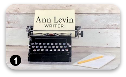
Straightforward
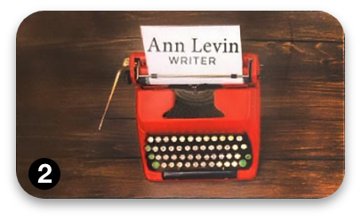
The red typewriter sure pops. I saw it
before I read “WRITER.”
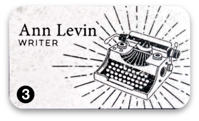
How about using color instead of black lines?
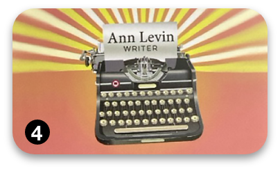
Hmmm… What does the sunburst signify?
But, later, I changed my mind.
We talked about the cards, and suddenly the story behind them changed how I saw them. Now, take a look at my #1 choice.
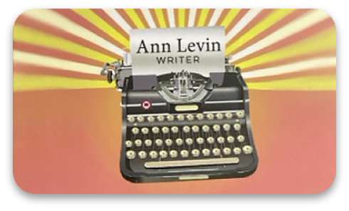
Here’s why: Ann told me she grew up in the ’60s and that she often writes about her experiences during that time. The psychedelic background actually ties in beautifully with her personal history and voice. It says something about Ann, the writer, that the other designs don’t!
All Ann needs now is a tagline or some short copy to help the cardholder make the design/Ann connection fast. That way, there’s no guessing, no ambiguity.
Ann’s cards and you: What’s the lesson?
Right now, Ann’s cards are more like creative collages—open to interpretation, layered with personal meaning. That may work for her goal, which is simply to get attendees at her readings to easily connect with her afterward. (She provides complete data on the back of the card.)
But when your goal is to get a response—to make a sale, earn a click, or drive an action—you can’t speak too softly. A good direct response design uses words and pictures to speak clearly, immediately, and with purpose. Every visual element works in tandem with the words to get the message across.
Otherwise, you’re just hoping people will connect the dots. And in marketing, hope is not a strategy.