A Fundraiser's Best Friend

DIRECT RESPONSE DESIGN
Design for leads. Design to prompt donations. Design for retention. Direct response advertising is all about design aimed at getting results, whatever your nonprofit’s fundraising goal is. So if you’re looking for ways to raise your ROI, please read on.
You’ll find out …
Direct Response versus Branding: Can you tell the difference?
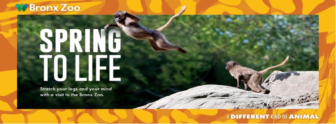
Through the years, I’ve given a bunch of talks on direct response design, and I always start with a picture of a poster or billboard, like the one below:
Then I ask: Is this a direct response ad or a branding one? Invariably, some are not sure. What do YOU think?

Direct Response Design
is not pretty image-building.
Direct response design is any type of creative that works to accomplish one thing: Push prospects to take an action — not next week or next month but NOW. You’re probably thinking, ah you mean good old direct mail. Well, it’s much more than that because direct response includes digital ads (landing pages, emails, and the like), as well as print creative.
Direct response advertising is a nonprofit’s best friend because you can easily track and measure the effectiveness of a digital ad or a direct mail package. So winners and losers are identified quickly, allowing you to do more with your limited marketing dollars. To get the job done right, marketers don’t call on just any designer or writer. They use specialists — direct response designers and direct response copywriters — to help them reach their lead generation or fundraising goal right away.
Branding design, on the other hand, is not out to trigger immediate action — it’s simply to get into your head. Nothing nefarious about it: In a sea of so many nonprofits, you need to stand out and be memorable. As the American Marketing Association explains it, you can do it by branding “a name, term, design, symbol, or any other feature that identifies one seller’s goods or service as distinct from those of other sellers.”
Using those definitions to guide you, can you guess which area of design the Bronx Zoo poster represents? Yes, it could only be branding, because its main mission is brand awareness. It distinguishes the Bronx Zoo from other zoos, with the tagline “a different kind of animal.” Clever copy, right? But there’s no sense of urgency. No offer. It doesn’t incentivize you in any way to visit the Bronx Zoo now. You can “spring to life” with a visit to this zoo anytime you want.

Now test yourself with a nonprofit digital ad, which I created:
Direct response or branding?

Yep, this is a direct response ad. Here’s why:
- This ad is directed to a specific audience. The marketer placed it just in digital newsletters where they believed a potential audience might exist. The ad tells who it’s for and offers special pricing, but only if you act by the deadline. All these factors, along with design elements that reflect the product, make for an ad that has a strong chance of reaching its goal: getting people to sign up immediately for the course offered by the Institute for Jewish Spirituality.
- Strategic use of space, color, and design elements is critical for delivery of the sales message. Even though this is a small ad, it does the job: engage and push readers to click on the button before they miss the savings opportunity.

The 6 factors that make direct response work and how I integrate them to get results.
Whenever I start a direct response design job for fundraising campaigns, I consider these factors:
- Target audience
- The hook
- Design and copy – do they act as a team?
- Personalization
- Possible special incentives
- Call-to-action (CTA)
I then continue my design process by asking a variety of pointed questions:
1. Who is your target audience?

Let’s go back to the Bronx Zoo branding poster. It can be placed just about anywhere. At a bus stop … on a highway … at a sports event … in a coffee shop … you name it. Who sees the poster? A whole mix of people because it’s not targeting anyone in particular. Just the general public. A direct response ad has a specific demographic in mind. “Who is your target audience?” is one of the first questions I ask because it helps me know how to position the correct look of the creative. For example, if I am creating a flyer that targets retirees who are also Mets fans, I know I should probably use orange and blue, and large fonts. The more you know about the group you want to persuade, the easier it is to frame the content and design around things they can relate to.
When you keep in mind your audience, as well as your mission and your marketing channel, you can better decide which kind of design direction will really work. Yeah, spending money on a piece that folds out and comes in a special box can make some of your major gift donors feel special. But for appeals to attract new leads or to get individual donors to give more, letters are a better choice. It’s also the simplest vehicle for telling your story (see #2).
Why is that? People are very skeptical. They know what’s promotional and may quickly discard it. Letters that have a serious, earnest appearance often get a second look. That’s reason enough to ask yourself: Will photos and a large headline get your audience’s attention to prompt giving? Or will something that looks like personal correspondence do the trick?
2. What's the hook?
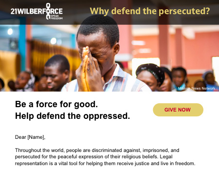
A direct response fundraising effort is nothing without the hook – such as an emotional pull or an alarming fact that grabs attention and becomes “The Great Motivator” for response. I show some examples below. You might think that’s all about the copy. Not quite, because design also plays a big role. Take the example below: It’s an email appeal I created, where the emotional hook is a man visibly crying and praying. He is being persecuted for his religious beliefs, and the story that follows explains how 21Wilberforce provides much-needed legal representation to people in such dire straits. Powerful.
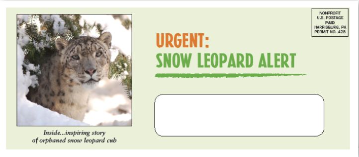
Below is another example of a hook: Animals have a place in the hearts of many people, especially if they are orphaned. So, to bring attention to one of the world’s most endangered mammals, the Wildlife Conservation Society made the story of an orphaned snow leopard cub become the hook for a direct mail package I designed. The photo and caption on the outer are strategically placed in a spot that can’t be missed. And the headline gains even more urgency with a sharp underline. Very clean and direct, but not overwhelming, right? This envelope gently but firmly pulls on people’s caring emotion.
3. How can I smoothly integrate design with copy?

When I worked at Time Inc., I remember a writer asking me, are you a reader or do you just put the copy down without reading it? Well, I am a reader, because you don’t design in a vacuum. Design and copy need to work together, like a couple in a marriage. It’s teamwork all the way. That’s why I make sure I work with a direct response copywriter I am in sync with. Sometimes the writer comes up with the concept, and sometimes I start the ball rolling by giving the writer a rough copy and design idea of how something could work. A compelling headline will draw in the reader, the copy can engage, but in many cases the piece comes fully alive only with the right design.
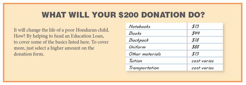
My creative process? I work with the writer to comfortably move readers along, help them get the message, and finally take action. I ask myself: How should the content be organized in the space we have, for easy readability? How can I visually make it flow? Will there be room for some easy-on-the-eye white space, or should I ask the writer to cut? Do I include bullet points, for easy scanning? What graphics will make key points pop?Do people see quickly how their donation will make a difference? (See example below.)
Figuring out the answers to all of these questions, and more, means a higher chance for better response … and that’s what I aim for, every time.
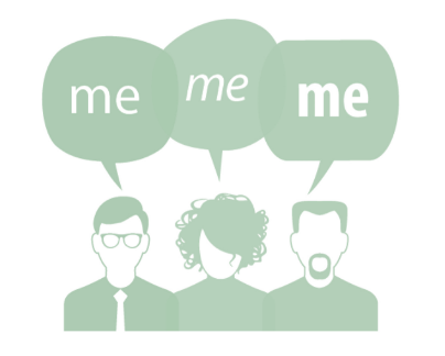
4. How can the marketer personalize the campaign? Or target the “me” in specific segments?
Years ago personalization basically meant you could inject the prospect’s name in a number of places in the creative, in order to “personally” connect with the customer. It worked. But now – with marketing personalization – you can go many steps further. You can use data to come up with product messages that reflect the specific interests of an individual prospect or group. You can design your campaign around your customers’ personal needs. That’s powerful stuff!
The secret to its power is obvious: Personalization draws people into the piece, because they think, “This is prepared just for me!” And it also strengthens your ask.
Here are two examples of marketing personalization in action:
In landing pages. To raise funds for a recent climate crisis incident, a Facebook ad was targeted towards a user who fit the correct demographic. Being in someone’s feed increased the chances of getting noticed, getting a click — and getting the user to the landing page, which was specially designed to provide more information and ask for a donation.
In the ask string: When you know how much someone donated last year, you can personalize the ask string.
For example, give someone who donated $50 during last year’s campaign the option to give more in their range:
☐$50 ☐$100 ☐$200
But if you know the doner gave $250 you create a higher ask string:
☐$150 ☐$250 ☐$500
5. What can add a special lift to response?
You can pull quotes from various sources and add glowing testimonials to engage the reader, but you should also consider these two strong incentives to raise response …
A Matching Gift or a FREE GIFT that’s unique to your nonprofit. Both work wonders.
MATCHING GIFT: If you are lucky enough to have a person or corporation to agree to match gifts, this is a proven tactic. I make sure it’s upfront and supports the Call-to-Action.
Can be a graphic:
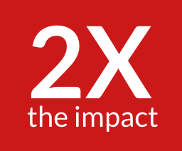
$100 is now $200
FREE GIFT: Pictured here is a free, one-of-a-kind greeting card, which we promoted on the outer and inserted into a direct mail package for the American Ballet Theatre. My agency recommended it because there was a lot of excitement around the art and costume design for a new ballet production, and we wanted our mailing to capture some of that excitement in a way that ballet lovers would treasure. This card, designed by a well-known pop surrealist, did the job. The promotion was a big winner – 50% increase in new memberships, compared to the client’s previous creative — and I’m sure this gift with that whimsical illustration played a part in its success!
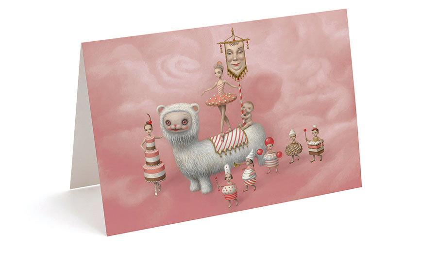
Plus this memorable card added an additional benefit: the recipient is reminded of the magic of the American Ballet Theatre! Click here to read the case study.
6. How can I make the CTA a clear call to action?
Direct response design gets readers moving because it incorporates a strong sense of urgency – and knowing where to place the right design elements can make all the difference in driving prospects to action. Here are a few things I do:
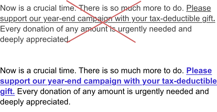
Make sure text links look like links.
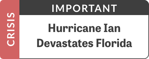
Create urgency by using words like emergency and crisis in a bold graphic.
For direct mail on or near the reply card include an easy-to-type url.
Also test a QR code.

Fundraising Goal Thermometer

Other considerations:
FOR PRINT:
I give the response card the respect it deserves by making it clear and easy to fill out. White space, a strong color, and arrows are three of my favorite tools for this vital component.
FOR DIGITAL:
For first-time donors and leads, keep the form short — just ask for name and email address. Maybe street address. Long forms will suppress response. This isn’t the time to collect more data. And make buttons look like buttons — because that’s where the action is!
Most important: I don’t distract attention from the CTA by “busying up” the space. I make it simple for the customer to decide to place an order now. Want other ideas for design elements that work? Read my blog post “My Top 10 Design Elements to Lift Response.”
Final Word and Thought.
Testing. Even if you have a design that is working, the question is, can it be better? Can you get more leads, increase the amount someone donates? That’s why you need to test. I’ve seen just changing a button on a website from black to green increase response. It’s important to try new incentives, new images, new formats, new headlines, and more.
What’s another reason for testing? No one knows exactly what will work with your target audience straight out of the box. I know what worked for other organizations, and I start with that information. But will it work for your business or nonprofit? That’s why you need to evaluate, adjust, and retest periodically. Only that way will you know what will really give you the best results.
.
Now that you know the why and how of direct response design, let it work for you. When you’re ready to test, a direct response designer is your best option. Here’s to getting serious about raising money for your nonprofit and increasing your doner file!