Top 3 Reasons for Charts

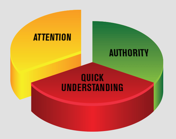
Did this chart catch your eye?
Today, you may have just a few seconds — maybe less — to grab someone’s attention. Charts (pie, line, bar, and others) are proven attention-winners. Of course, they’re perfect for presentation of data. But, with a little creative flair, you can also employ them to make your most important sales messages pop, online and off.
What makes charts work?
No need to rack your brain — just look at the chart above. In addition to ATTENTION, they provide AUTHORITY and QUICK UNDERSTANDING. A chart speaks volumes, with just a few words. So today’s multi-taskers can quickly say, “Aha, I SEE your point!” Moreover, a chart lends an air of authority to what you’re presenting because it supports your point or actually proves it, when you include relevant data. Add a short caption to your chart and you can be certain it will be read.
Take a cue from infographics: Get MORE visual!
You’ve heard of Information overload? Maybe that’s why infographics are now so popular in content marketing. They break things down with visuals, including charts, and a pinch of razzle-dazzle. But you don’t have to go that far in your promotions — a simple, unstuffy chart will be just as effective, whenever you want to:
- Make a strong price or savings statement
- Provide competitive product comparisons
- Visualize a problem/solution
- Show a relationship
- Highlight a trend
Try it! Charts might be just the thing to make your promotions stand out. Let me know if I can be of assistance.
