Is your response rate getting a little stale? You can hit refresh with some simple design elements that work hard to communicate your message and get you better results. Sound good? Then let me share my personal list of 10 go-to elements, from proven classics to the try-something-new.
How many could you use to lift response? Which element is my favorite? Read on and see.
1. The Box
Yes, thinking “inside” the box can get results! Proof: The continuing success of a direct mail classic, the Johnson box. Just put your offer or your main product benefit (or both) inside a box at the top of a sales letter and you’re off to a winning start. Or use an iteration of the box – the sidebar – to highlight other big benefits, as well as testimonials. Did you know: The Johnson box is now popular with email marketers, too. It goes by this name: the email preheader.

2. Certificate Border
Put it around an order form or a product guarantee – create an “official” appearance, instantly.

3. Circles & Icons
Want to give your money-back guarantee or limited-time offer a more commanding presence? Contain the important words in a circle. Or design a special icon, to really stand out.

4. White Space
Too much text in a small area scares away most readers. Copy scattered here and there is confusing. White space calms things down and encourages closer reading.
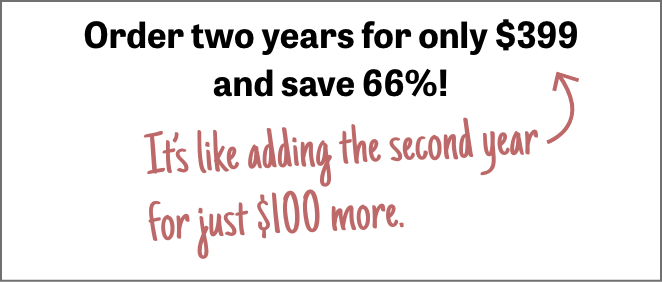
5. Handwriting
When you want your message to be a little more personal, or you want a key benefit to pop even more, a handwriting script will do the job.
6. The Check Mark
To draw attention, inject positive vibes with a check mark. Next to a statement, it communicates an emphatic Yes! It’s especially effective in a short list of points — instead of bullets, use check marks.

7. Color
I could write a book about it! One huge color benefit: giving your message that extra push. Example: In designing a 3-color job for a financial client, I often pair black type with a color that brands the product by conveying trust or wisdom, like blue. Then, to move the call-to-action or the offer to center stage, I select a bright color (like red) that will stand out against the blue and black.
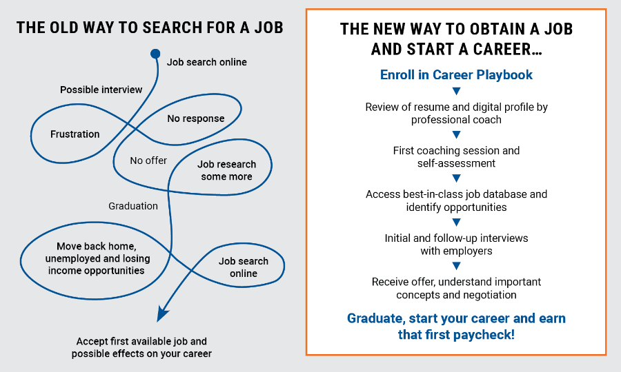
8. Graphs & Charts
Ever use a bar graph to pit your product against the competition? Or display all the good that donor contributions will do in a pie chart? These visual cues can speak volumes, with an air of authority. Plus, consider this: a simple infographic, to show how your product works and the flow of benefits to buyers.
9. Bold Text
Sprinkle it judiciously in your promotions, and readers won’t miss what you most want to communicate when they scan the page.
10. The Arrow
Point to something and, snap, you pique interest. Maybe that’s why the arrow is my favorite design element – whether it’s used to direct readers’ eyes to a major benefit or deadline, or to provide a powerful call-to-action.

These are just a few easy ways you can employ certain design elements to refresh your response rate. If you need any assistance, contact me.