Ever go to a car dealer, or even an ice cream place, and feel almost paralyzed by the seemingly endless choices you’re given?
Well, there’s a name for that: “analysis paralysis” – what you don’t want customers to experience if you seek good response. As a graphic designer, I always strive for results. That’s why, when I design direct mail, brochures, emails, or websites, I often rely on Hick’s Law to help get the job done right.
What is Hick’s Law?
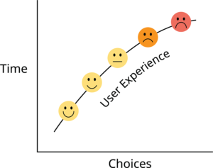
Hick’s Law is a well-tested design principle created by two psychologists and used by many savvy companies. It states that the more choices you present to your audience, the more time it takes them to make a decision. This can lead to decision fatigue (note the two grumpy emojis below) — causing consumers to abandon the action you want them to take. In other words, say goodbye to a good prospect.

Why does it matter for your marketing?
In a world full of distractions, your message must be clear, uncluttered, and easy to act upon. Whether it’s a call to donate, sign up for a subscription, or make a purchase, a well-structured design reduces decision time and raises your chances to lift response.
How can you easily apply Hick’s Law?
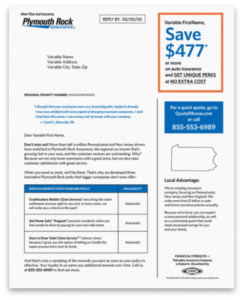
- Simplify your layout: Avoid overwhelming your audience with too much information at once. Pick your most important message and don’t meander. A good example of simplicity at work: for this direct mail piece I got right to the major benefit by placing the strong savings offer front and center.

- Limit the options: I have discussions about this with my clients very often, especially regarding fundraising emails. Stick to one CTA url. It can be used in several places in the email (which I encourage), but all urls need to go to the same landing page to make a donation. If you have another link, say to the Message from the President, you have too many, and you’ll lose the donation.
- Guide the eye: Use visual hierarchy to lead your audience from one element to the next in the most logical way. Box in key points, as in the promotion piece above. Consider a comparison chart.
By leveraging Hick’s Law, your marketing materials will feel less cluttered and your audience will have a smoother experience, ultimately increasing the likelihood of them taking the desired action.
