Try testing a new call-to-action email button. According to Hubspot by changing the design of your call-to-action, you can improve your click-through rates by 1300% (or more!)
Four ideas to try are:
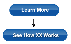
1. Use different copy. For example, instead of “Learn More” try “See How XX Works”:
2. Add a drop shadow:

3. Use a different color or texture:

4. Add an arrow and even change the shape:
**KEEP IN MIND ** When you are testing, a button needs to look like a button.
Plus: Do not create a long button along the bottom. People will think it’s a footer — not a button.