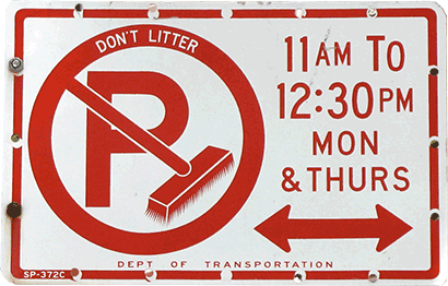
For those of us who live in New York City this alternate side-of-the-street parking sign is very familiar. But, if you are a tourist, the sign appears to be about littering, not parking. You may even wonder what the “P” stands for.
This is a perfect example of why Conciseness and Clarity are important design principles. Let me explain:
CONCISENESS — In addition to the “DON’T LITTER” message with street cleaning times, this sign has the “P” for No Parking, which is what people are most concerned about. It would be better if it just had the one message — NO PARKING Between 11AM To 12:30 PM Mon & Thurs.
CLARITY — The strong visual of a broom popping out and directing your eye to the words “DON’T LITTER” adds to the confusion. Eliminate that, along with the copy, and the real message of the sign comes through.
TAKEAWAY FOR YOU:
Always keep the 2C’s in mind with your direct response creative. Ask these questions:
1. Can you get your message down to its core? If your mail piece needs to have a second message, make sure it does not fight for attention.
2. Is it clear? I recommend getting a fresh set of eyes to review your message — ideally a person not at all connected to the project.
I can be the fresh set of eyes to review your current creative message. Contact me today!
