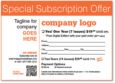
The above card can be designed to act as a more effective and powerful direct response sales tool. Here’s how I did it, with just six simple design tweaks:
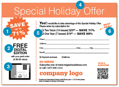
1. ADDED BURST. You have only seconds to grab someone’s attention. So I brought out of hiding the best component of the offer — the savings — with a proven attention-grabber: a burst.
2. MOVED “FREE DIGITAL EDITION.” As all direct marketers know, “Free” attracts customers. But this copy was hidden under the “Yes” copy! I moved it to a more prominent position and made it much bigger.
3. ADDED iPAD IMAGE. This emphasizes the “Free Digital Edition” even more and gives prospects a better idea of what they will receive.
4. CHANGED CARD TITLE. “Special Subscription Offer,” is fine, but if you can give a sense of timeliness to the offer – such as mentioning a holiday coming up – that’s even better. Here I changed the title to “Special Holiday Offer.”
5. PROMOTED DUAL OFFER BETTER. There are two offers on this simple card: the 69% savings on the top and the 71% savings on the bottom. To make it easier for someone to consider the savings and select the better option, I put both offers together. Plus I enlarged and bolded the “Save” copy.
6. HYPED BEST OFFER. See the arrow next to “Best Deal”? Arrows have a way of attracting attention – let’s use them!
When you look at both cards again, I think you’ll agree: the bottom card’s message is much stronger and easier to figure out quickly. Now let’s see what I can do to strengthen your designs.