
BAM — I found myself stuck in traffic and late for my appointment! Why did I cross over two lanes of traffic to take an exit I never take (when I could have taken the usual route) … simply because my GPS said so?
For me (anyone else?) it’s easier just to listen and follow along, since the GPS points the way for me at every turn. I’m only human … and it’s human nature to like following what makes life easier.
That’s the thought I want to leave with you. Why? Because when you adapt this “make life easier” thinking to the creation of your direct mail, emails, or websites, better response tends to follow.
Make sense? Then now is the time to consider:
7 easy design tips to make your promotions more successful
1. Numbers. Lots of copy is like so much heavy traffic to get through. Whenever you can, break it up into more digestible chunks and add numbers, like this:
- Use numbers to list benefits or simplify the order process.
- Keep the benefits or steps no more than three.
- Add simple graphics to draw the eye to the numbers.
2. “Billboards.”
This big box, with a colored background, really pops, right? I call it a billboard because it reminds me of what you see on the road. I often enclose the CTA – or some other important information — in such a box so prospects can spot it right away as they go through the promotion.
3. Arrows. A favorite of mine because they really direct the eye. You automatically know where to go when you see an arrow on the road. Same in print or online. Use an arrow to point to a deadline or anything else that your prospect needs to pay special attention to.
4. Buttons. Don’t overlook them if you want more clicks! Here are a few Best Practices in designing what works.
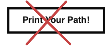
Make buttons look like buttons — and don’t confuse readers by using copy that doesn’t sound like what you want them to do. Below left is a button I saw recently, designed to get people to attend a printing event. I missed it entirely because it didn’t stand out as a button. Plus,”Print Your Path!” doesn’t exactly say R.S.V.P. — as the button on the right clearly does.

5. Checkmarks. The less a reader has to remember to do, the better. So do a customer a favor – check the box for them, whenever possible.

6. QR Codes. Who likes typing out a long URL that’s on a printed piece in order to get to the sign-up/order page? Add a QR code to the promotion and you could get rewarded with a Quick Response!

7. Forms. On initial sign-up forms, minimize the work and time: just ask for name and email address. Best Practice: use a one-column format. Never two or more.
Good luck!