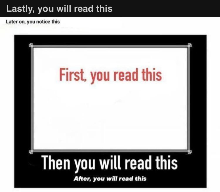
See the image above? I knew I had to share it with you when I noticed it in a few places on the internet. Why? Because controlling the order in which your prospects read copy can make a huge difference in designing successful promotions. So, now, let’s take a closer look at the image …
Did you read the red copy first? I did. And then I read the other copy, exactly as instructed.
Is that how we normally read? No, since we’ve been taught to read top to bottom. So why did we ignore the topmost line and go straight to the red in the middle? Because several important design elements are at play here, separately and together.
Let’s unpack how these elements work to attract our attention
- The White Space. Or what I like to call — Visual Breathing Room. A person’s eye can rest comfortably here. When you are skimming areas that contain a lot of content your eye naturally goes there. In the image above, the white space becomes even more eye-catching by being within the black box.
- The Text: Color and Size. The color scheme of the image is black and white. So when you introduce a strong color like red, you help steer the reader to where you want their eye to go. As for text size, larger doesn’t always mean more prominence! Note that the line “Then you will read this” is larger than “First, you read this.” So it’s the white space and red color, working together, that push “First, you read this” to the forefront.
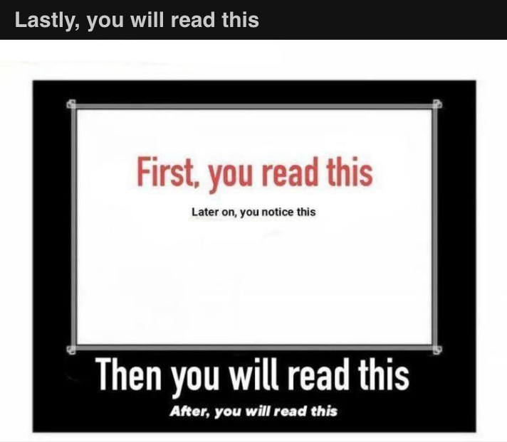
- Positioning: Location and Centering. For this email, I used a trick to get your eye to go to the image and read the copy as I wanted you to: I kept the image at the top, or “above the fold.” If you had to scroll down to see it, you would be reading it differently. Let me show you what I mean by putting the image “below the fold.” Read this now.
See the change? You read first what was first visible to you – the topmost line — and not the red copy! (Also, did you catch that I moved “Later on, you notice this” below the red copy?)

Now, a word about the three elements and a factor you can’t ignore: Skimming.
We all skim, especially on content-heavy media like direct mail pieces, brochures, and websites. When something catches our interest we stop to learn more. But only for a short time. Used properly, the three elements can quickly direct the reader’s attention to the major points in your message … upping your chances for a better response.
