Arrgh … Last month I was summoned for jury duty not once but twice – first by the U.S. District Court (blue, above) and then by the NY County Court (red, above). Who knew that each court has its own summons – and that each would want me around the same time!
While I wait for my day in court, I am trying to make the best of this situation by doing something constructive: I am examining how each summons was designed to determine who did the better job.
Before I give you my verdict, let me show you what’s “on trial” here, so you can decide with me.
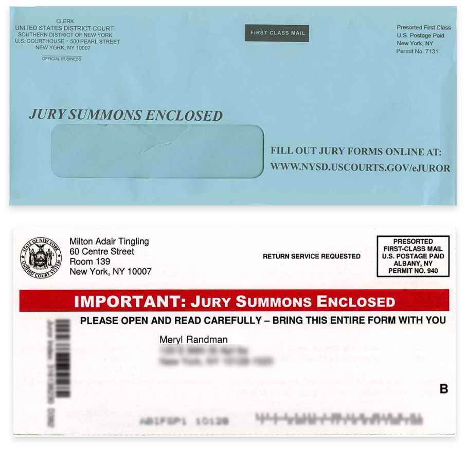
BLUE SUMMONS:
From the U.S. District Court
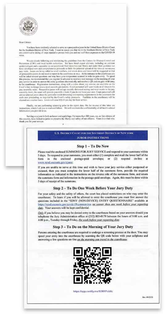
This consists of an envelope with two sheets of paper inside, a form and letter – a simple direct mail package.
What worked. The blue outer. This envelope certainly stood out in my mailbox. Have you tried a blue outer in your mailings? I’ve used them in the past with great success.
What didn’t work: The letter (front and back). Perhaps some legislation made them do it, but so much of the letter went on and on about Covid-19 and how they’re following CDC guidelines, etc. To make matters worse, much of the information was in a chunky paragraph that defied easy reading! The back of the letter was a little better: it had juror instructions (not all that clear) organized in steps. Plus they included a big QR code to scan, to speed your entry into the courthouse by answering a few questions online. But the website was as confusing as most of the package.
RED SUMMONS:
From the NY County Court, a self-mailer.
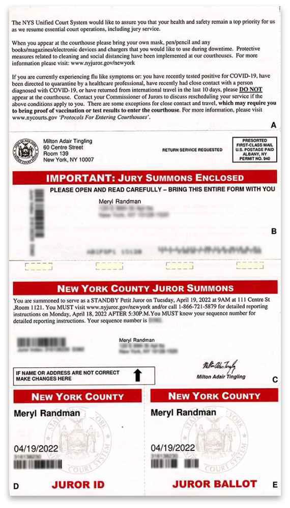
What worked: The neat, all-in-one presentation. No separate pieces of paper to deal with! But beware: Self-mailers are less personal and more promotional looking than a traditional direct mail package. They could quickly be tossed into the wastebasket, whereas a letter in an envelope is usually opened and scanned first! However, in a case like this, where the sender is part of the government, and the message is powerful, it works. Plus, who can ignore red bars?
What also worked: Each section was clearly defined and labeled A, B, C, D, etc. So it was super-easy to follow. Moreover, there was no information overload, with bullet points and boldface helping busy readers get to what’s important fast. To be sure, Covid was covered. But it was done in a separate section and in just three short, succinct paragraphs.
Now, let me ask you …
If you were to base your jury-duty attendance solely on these two summons, which one would you be more inclined to respond to? For me, the answer is clear: the red summons (NY County Court), because it really has the reader in mind, as shown by its attention to organization, clarity, and conciseness – three design factors that, when used skillfully, can greatly affect the response rate. And they reflect well on the image of any institution or business, too
POST JURY-DUTY NOTES
I ended up doing my jury duty at the NY County Court, and I have to say, compared to previous jury-duty experiences, this one was so much better. One big reason: organization. For example, when instructions were given on what to hand in, all they had to say was, “Rip off parts C and E.” Who knows what goes on over at the U.S. District Court, but if their blue summons was any indication of what the day would have been like, I’m so glad I got a reprieve!
So what can we make of all this?
Simply this: Don’t underestimate the power of good design and the impression it can make on your prospects – and on your response rate. Case closed.