Research proves that the best way to get your audience to respond to your email is with a responsive email.
For those who are not sure what I mean by responsive email — it’s an email that is designed and coded to enable the device it is being read on (desktop, tablet or smartphone) to automatically adapt the layout to better fit the reader’s current screen size.
Below are examples of how my latest newsletter looked in responsive email format and a desktop version.
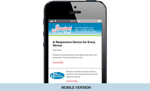
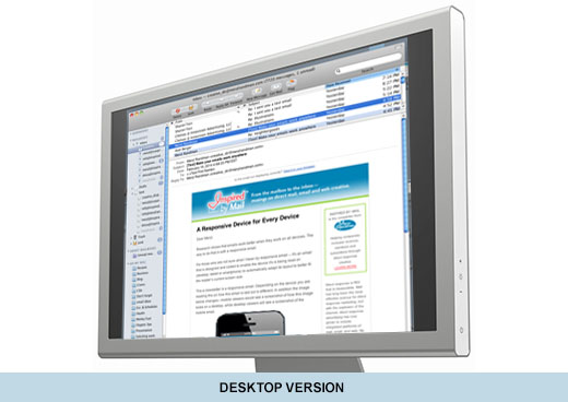
Notice the same email looks dramatically different depending on the device. Elements of the mobile version image have been “stripped away” to two key points. The rest of the content is either hidden with the “Read More” option or is absent. Stripping down is a needed component of mobile emails. Why? Mobile users are often on-the-go or engaged with other activities. If you want your email read, a simple, direct, clear message and image work best. Therefore the most important points need to be determined and all else “stripped away.”
Another thing to consider is if an email is not formatted properly for the user’s device — meaning not responsive, the user becomes less engaged. This translates into a lower click-through rate.
Responsive email is more complex to design and code than standard email, and therefore costs more. That said, it will result in a better user experience and has been shown to produce a higher click-through conversion rate, which can improve your ROI.