As I was working on a direct mail package recently, a curious thing happened. The client kept asking me to make some of the important content “less bold.” In effect, to de-emphasize the marketing message. So why do it? Because, she explained, the bolded copy didn’t look pretty. Huh???
As direct marketers, we don’t go for ugly, but we may not always aim to be the prettiest, either. Our aim is to get response. And bold is a powerful visual tool to help make that happen.
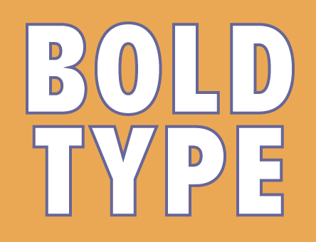
Bold makes copy pop — thus making it more scannable.
The right phrases or subheads in bold direct the eyes of busy readers to quickly see what you most want them to see, at first glance. Result: Your promotion could get a more careful second look, instead of simply getting trashed right off the bat!
Take, for example, this two-color blurb from a flyer. Using bold (in green and in body color) makes the product’s competitive edge so much easier for the reader to spot.
| Why XYZ Financial? Most important are profits. XYZ Financial is one of the rare services that tells you not just when to buy a particular stock but also when to sell. Because profits are only theoretical until you sell. |
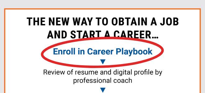
Another example: Part of a fundraising letter, where bold is used to point out the benefits of donating.
| I want to remind you that more than 60% of the kids in Honduras never reach the sixth grade. By donating now, you can provide what they can’t afford: basic things like pencils and notebooks. Things that your kids may take for granted. With a $100 tax-deductible contribution, you can directly impact the life of a child in Honduras … you can directly impact the future. |
But can you ever have too much bold?
Yes, just like you can have too much chocolate if you’re served 5 or 6 chocolate treats all at once! If you bold everything, nothing seems important – or inviting to read. Are there alternatives to bold? Sure. You can, for example, use ALL CAPS or italic, depending on how emphatic you want your message to be. Here is a hierarchy of choices:
- Bold with a complementary strong color
- ALL CAPS with a complementary strong color
- Bold in body color
- ALL CAPS in body color
- Underlining, but only in print materials. (Not recommended for online promotions because it could be mistaken for a link.)
- Italic
What about paper considerations?
Good you asked! If you’re printing on uncoated stock, beware: inexpensive uncoated paper will absorb the color, therefore making colors darker. This can be tricky to fix, since all colors look bright when you view the job on a monitor. For example, this can happen:
The blue looks almost black when printed. Yikes, of course you don’t want that! The question then is, how do you know how dark a color will print? That’s why you need a designer — we can check it out, using our Pantone tools.
If you want to make some BOLD moves with expert guidance, let’s chat!